A picture is worth a thousand words, but ten pictures are worth much less than ten thousand words
One of the most common problems with visualisation, especially in the media, is that of “chart junk”. Graphics designers working for newspapers and television channels like to decorate their graphs, to make it more visually appealing. And in most cases, this results in the information in the graphs getting obfuscated and harder to read.
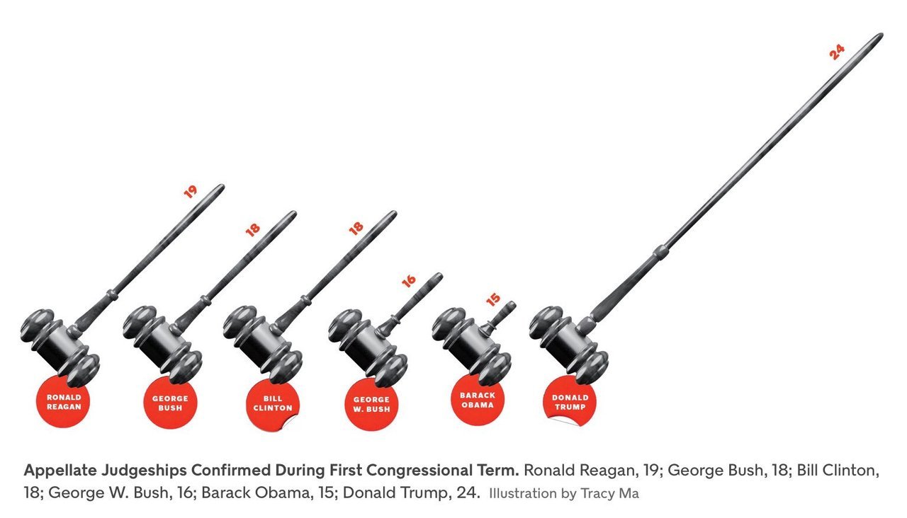
The commonest form this takes is in the replacement of bars in a simple bar graph with weird objects. When you want to show number of people in something, you show little people, sometimes half shaded out. Sometimes instead of having multiple people, the information is conveyed in the size of the people, or objects (like below). 
Then, instead of using simple bar graphs, designers use more complicated structures such as 3-dimensional bar graphs, or cone graphs or doughnut charts (I’m sure I’ve abused some of them on my tumblr). All of them are visually appealing and can draw attention of readers or viewers. Most of them come at the cost of not really conveying the information!
I’ve spoken to a few professional graphic designers and asked them why they make poor visualisation choices even when the amount of information the graphics convey goes down. The most common answer is novelty – “a page full of bars can be boring for the reader”. So they try to spice it up by replacing bars with other items that “look different”.
Putting it another way, the challenge is two-fold – first you need to get your readers to look at your graph (here is where novelty helps). And once you’ve got them to look at it, you need to convey information to them. And the two objectives can sometimes collide, with the best looking graphs not being the ones that convey the best information. And this combination of looking good and being effective is possibly what turns visualisation into an art.
My way of dealing with this has been to play around with the non-essential bits of the visualisation. Using colours judiciously, for example. Using catchy headlines. Adding decorations outside of the graphs.
Another lesson I’ve learnt over time is to not have too many graphics in the same piece. Some of this has come due to pushback from my editors at Mint, who have frequently asked me to cut the number of graphs for space reasons. And some of this is something I’ve learnt as a reader.
The problem with visualisations is that while they can communicate a lot of information, they can break the flow in reading. So having too many visualisations in the piece means that you break the reader’s flow too many times, and maybe even risk your article looking academic. Cutting visualisations forces you to be concise in your use of pictures, and you leave in only the ones that are most important to your story.
There is one other upshot out of cutting the number of visualisations – when you have one bar graph and one line graph, you can leave them as they are and not morph or “decorate” them just for the heck of it!
PS: Even experienced visualisers are not immune to not having their graphics mangled by editors. Check out this tweet storm by Edward Tufte, the guru of visualisation.
